
Latest Posts
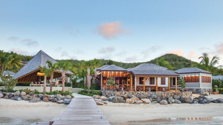
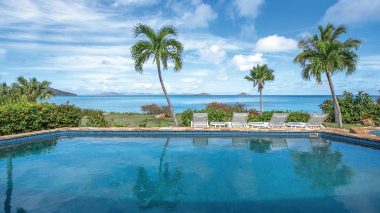
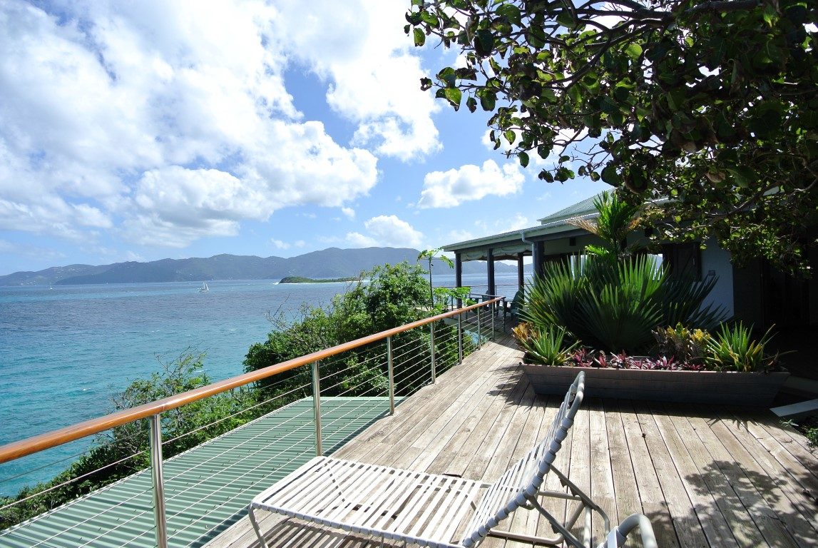
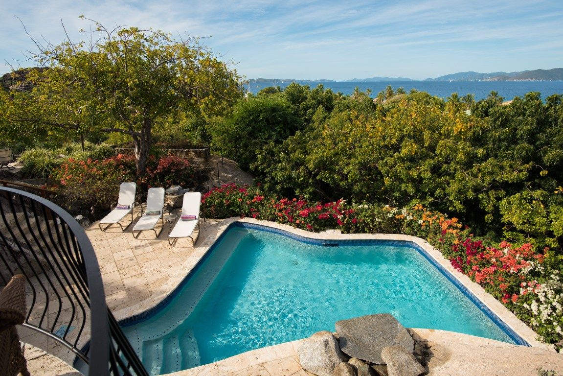
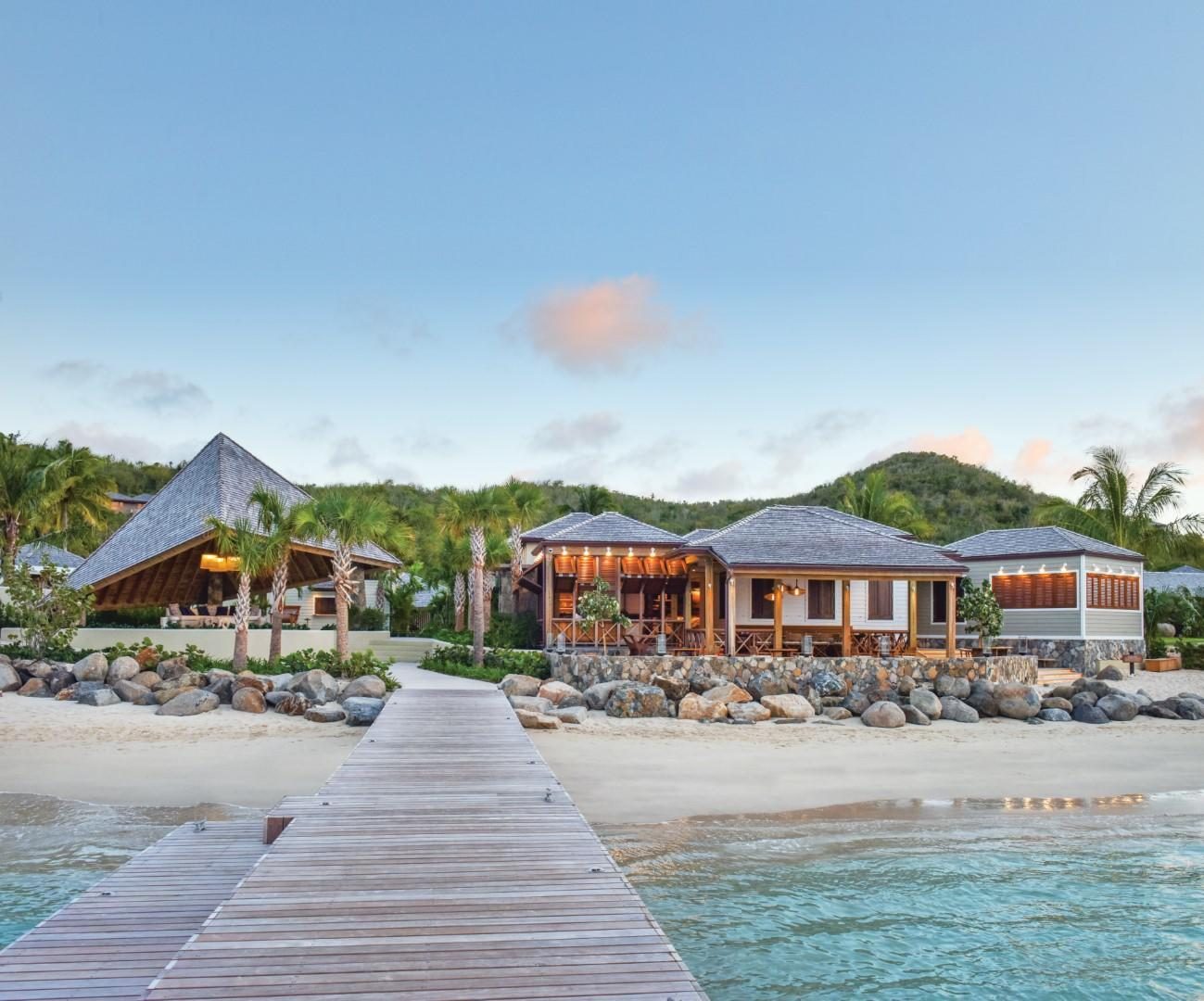
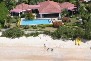
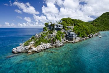
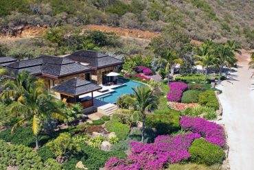
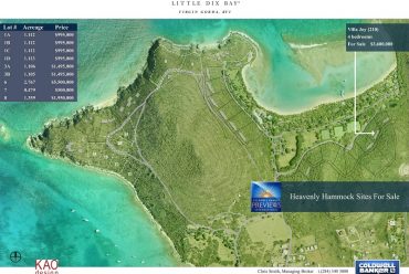
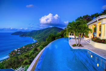
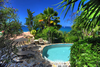
Featured Property
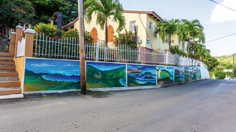
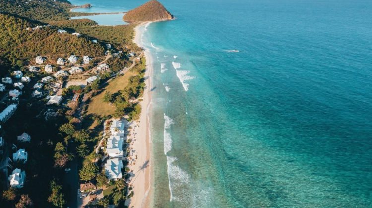
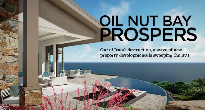
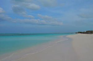
September 2016 brought devastation to the British Virgin Islands like many had never seen. Hurricanes Irma and Maria left a path of destruction and no island was spared. Tens of thousands of people lost everything, and it’s isolated location...
Read More


Yachting
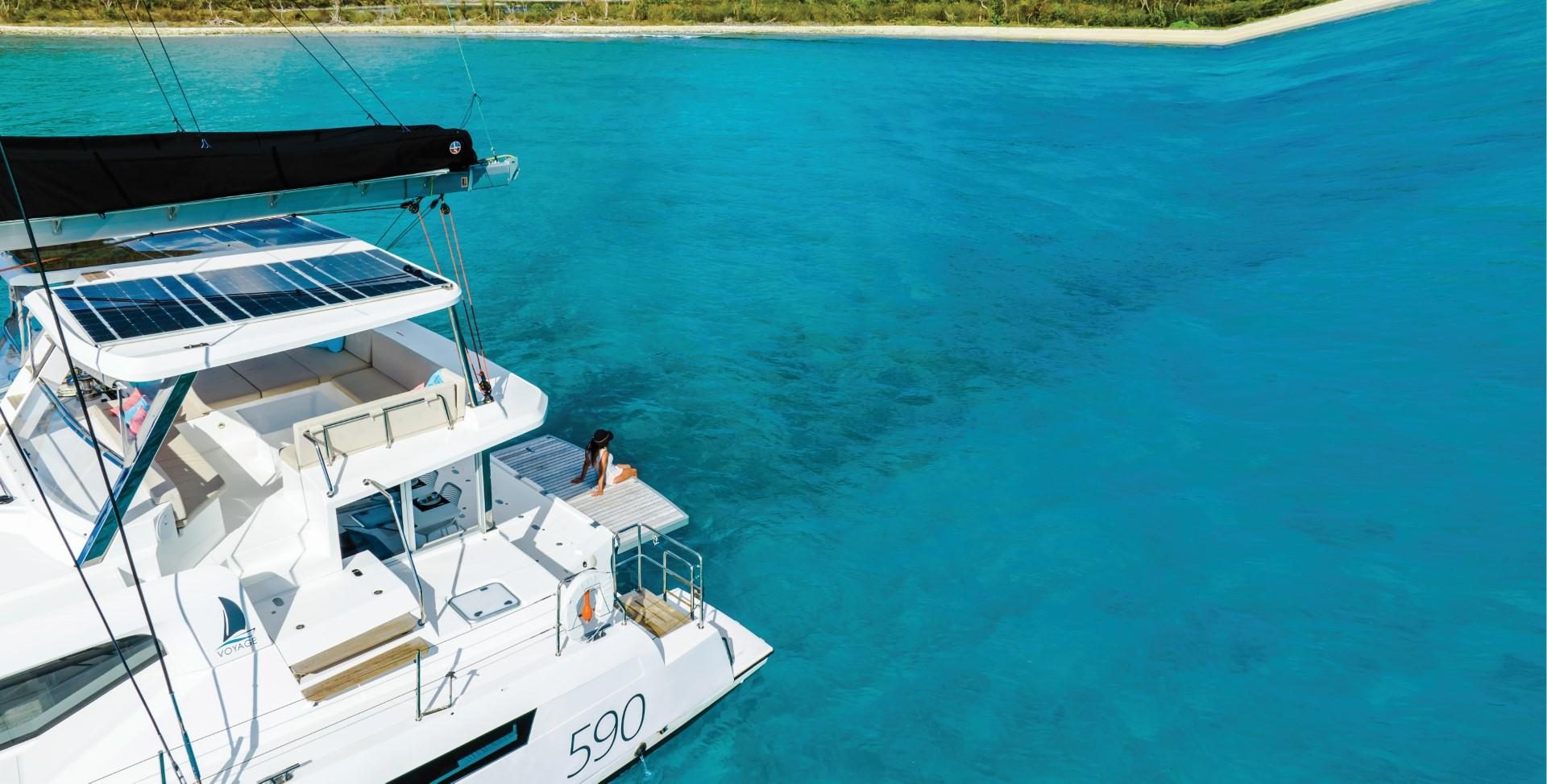
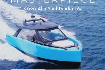
For almost 30 years VOYAGE Yachts have built beautiful, international award-winning yachts well known for their strength and quality craftsmanship. VOYAGE Charters is based in Sopers Hole Marina and incorporates the West End Boat Yard, owned and operated by...
Read More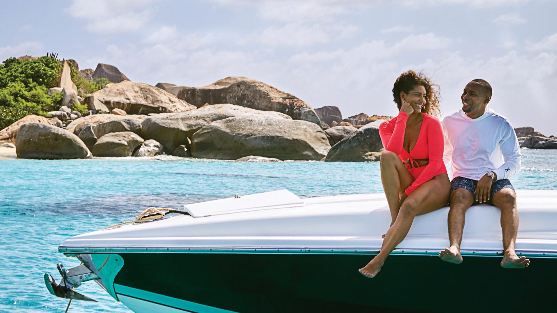


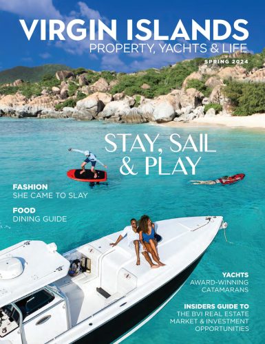
Latest digital issue
-

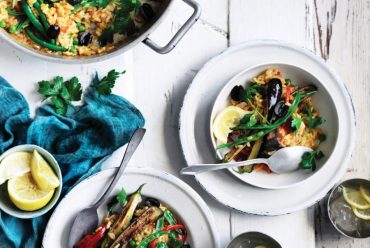
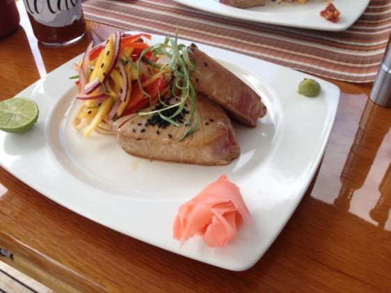
Lolalita’s Top Fish Recipe
Lolalita's Top Fish Recipe From Sea Level - Ring in spring: A recipe for Seared Tuna with Mango Jalapeño Slaw… -

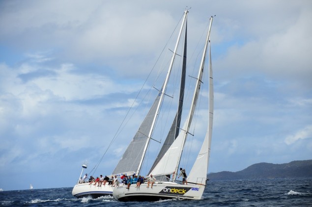
44 Years and Still Sailing – Spring Regatta
Spring Regatta - One of the BVI's Top Events Photography by Todd VanSickle This is arguably one of the most… -

Get The Best Of The BVI Today!
From the Editor OCTOBER is one of the VIPY team’s favourite issues. It is the edition when a vast section… -

Great Christmas Gift Ideas from the British Virgin Islands [Retail]
Things We Love - Great Christmas Gift Ideas from House [layerslider id="25"] [box] 1. Charge up all your travel devices… -

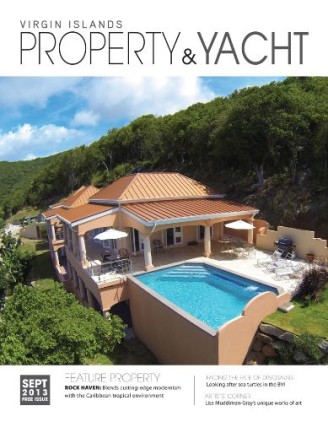
Editor’s Letter: September 2013 – BVI Property and Yacht Magazine
EDITOR'S LETTER, September 2013 After living in the British Virgin Islands for several years, residents will notice the decisive and…
-

CLOTH TALK
As I step inside UMI on Road Town’s Waterfront Drive, I’m drawn to rails of beautiful garments - a sheer… -

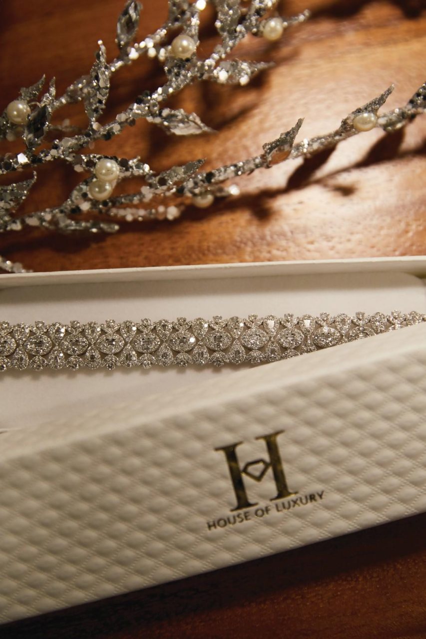
LUXURY BY DESIGN
House of Luxury is a family-owned jewellery and lifestyle boutique with industry knowledge built up over three generations. Sanjay Surtani… -

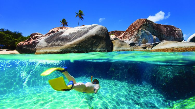
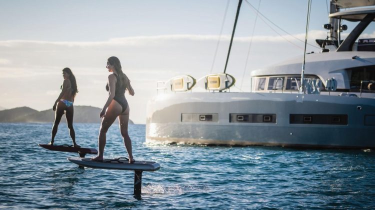
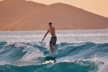
Foil & Fly
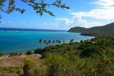
Virgin Gorda’s North Sound is a playground for watersports enthusiasts . Visitors and residents, including Sir Richard Branson are regularly… -

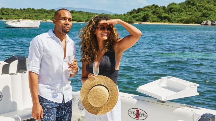
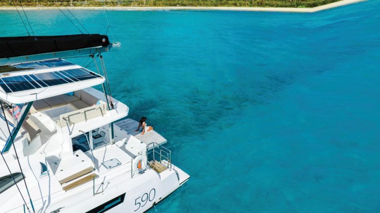
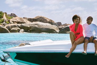
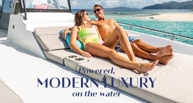
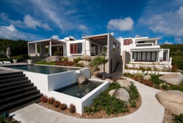
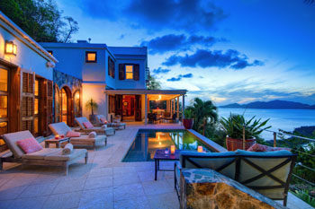
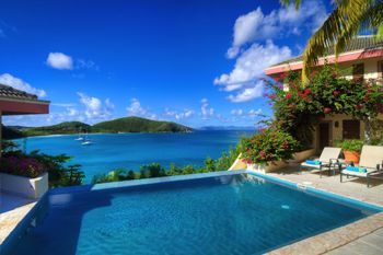
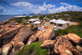
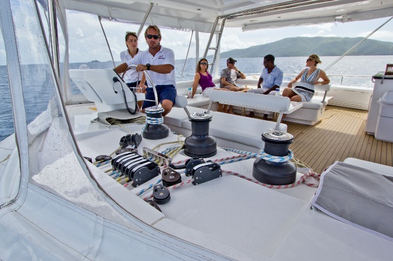
Your Private Villa on the Water
For almost 30 years VOYAGE Yachts have built beautiful, international award-winning yachts well known for their strength and quality craftsmanship.… -

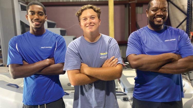
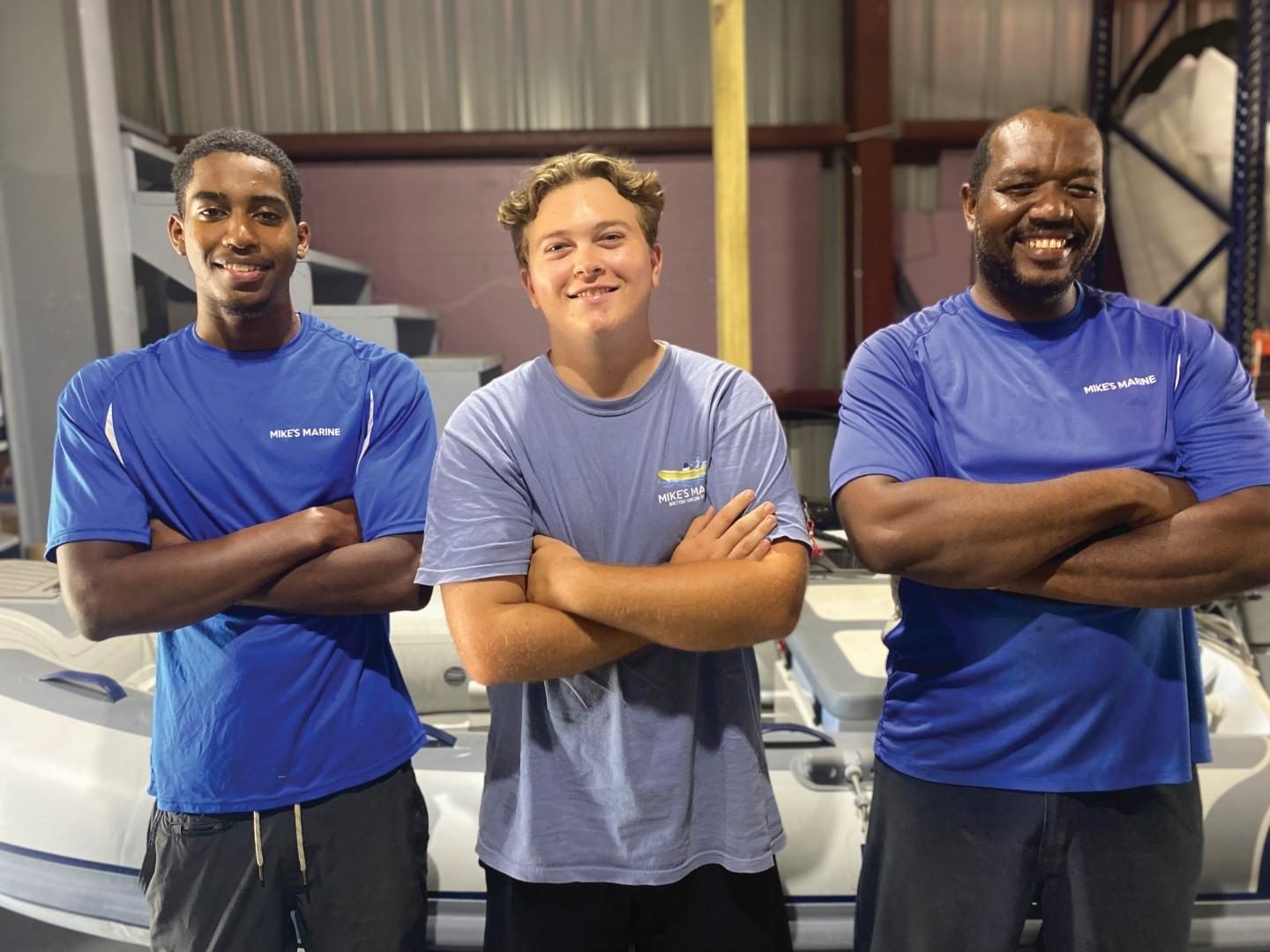
Meet Captain Mike
When I ask Mike how he became a boat-builder, he simply answers “OJT… On the Job Training!” he laughs. “After…